"I have been drawing for as long as I can remember. Illustrating has always been, for me, the most powerful way to communicate and empower an idea. Working as an illustrator has allowed me to reach different clients, discovering their potentials, and from an illustration, develop an idea that can help them grow as a brand and in a competitive market."
WESTHAFEN U-BAHN STATION
For the following illustration, I drew inspiration from my favorite subway station in Berlin. I was captivated by its letter crossword puzzles, the diversity of people, their varied attire, and the interplay of lights and shadows. With this piece, I aim to capture the punk and diverse atmosphere of one of my favorite cities.
THE MAGIC MOMENTS
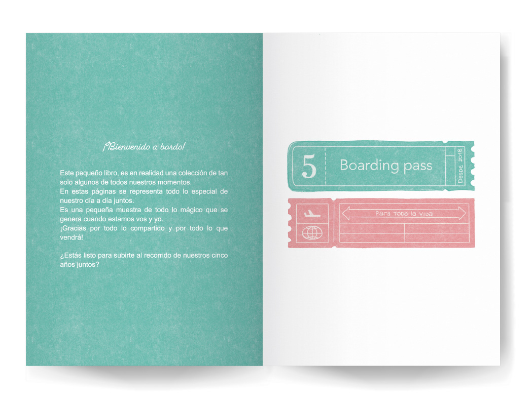
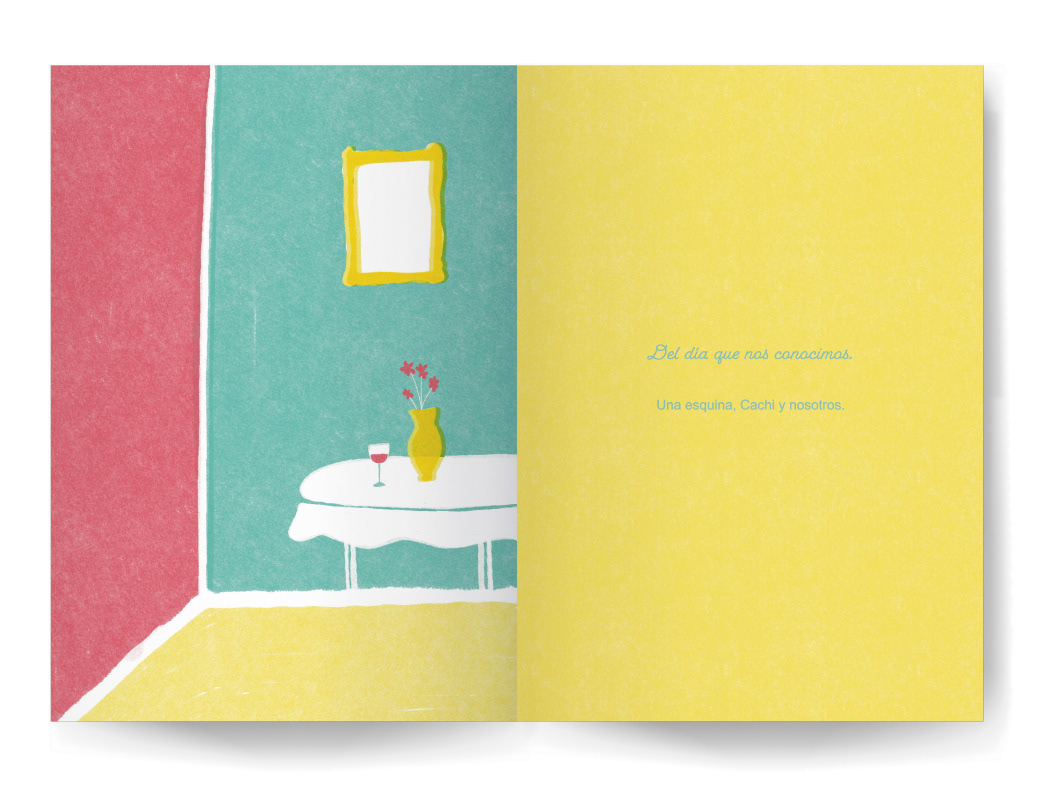
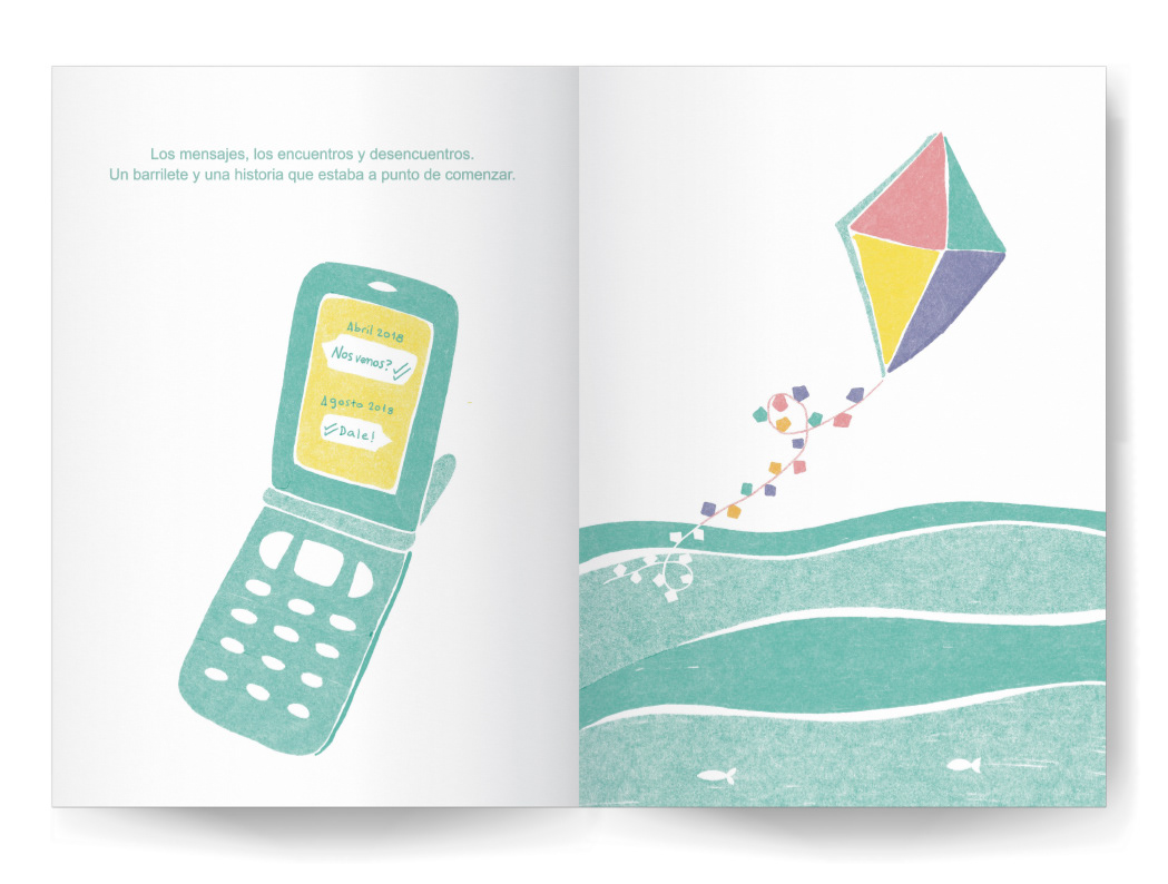
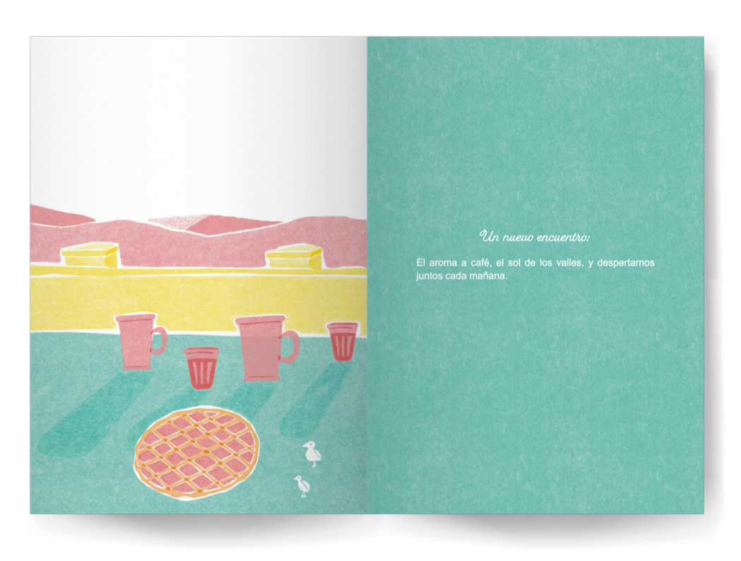
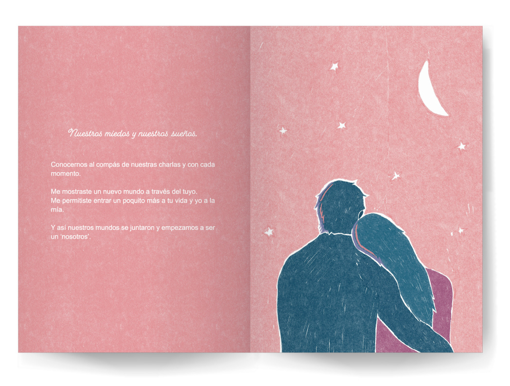
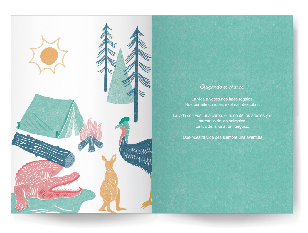
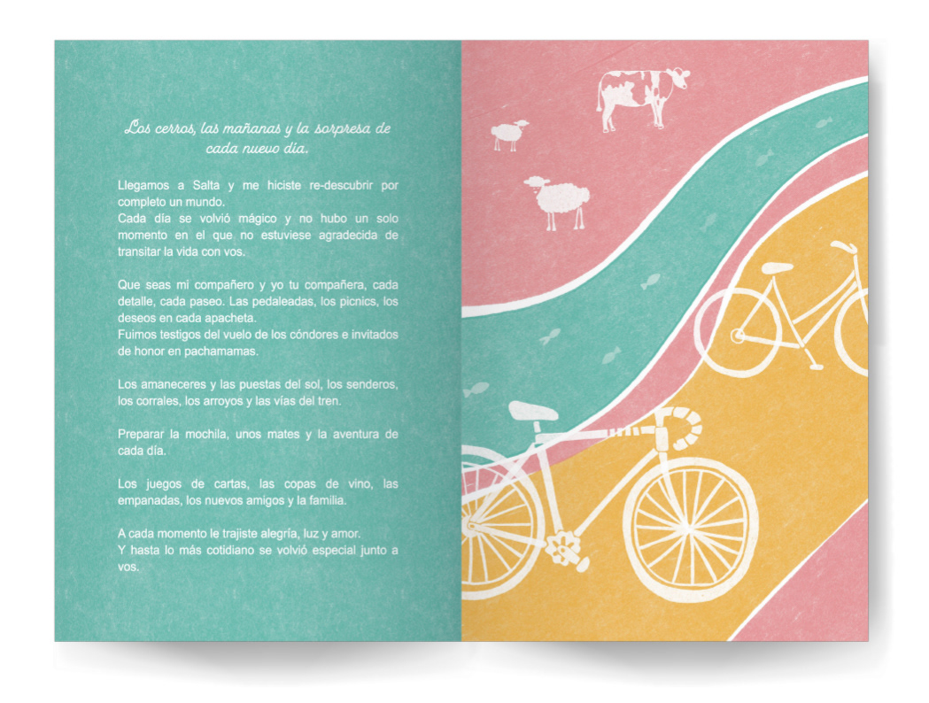
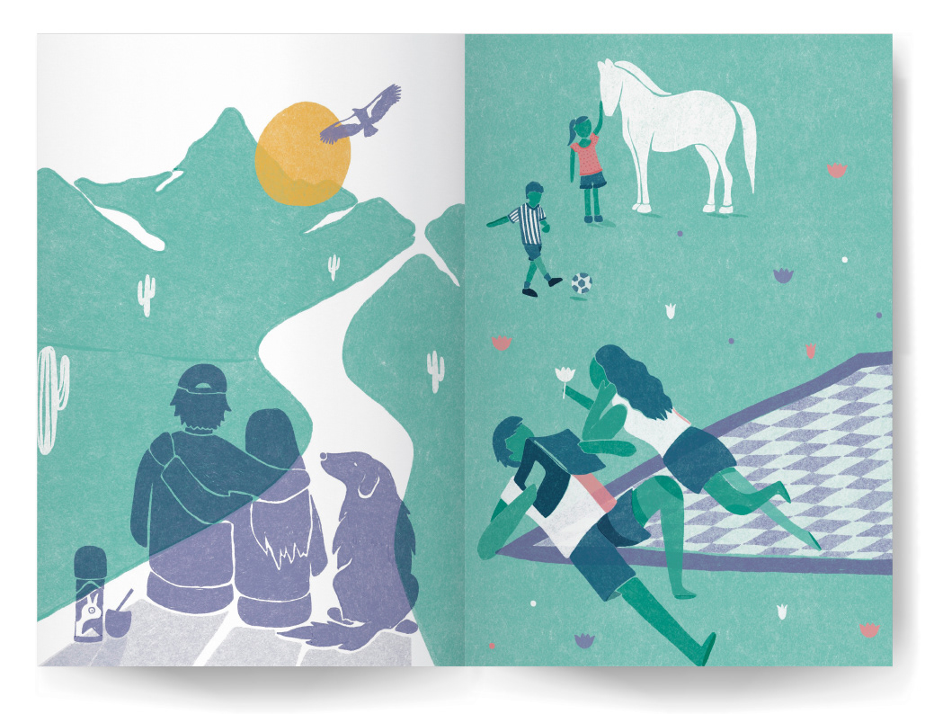
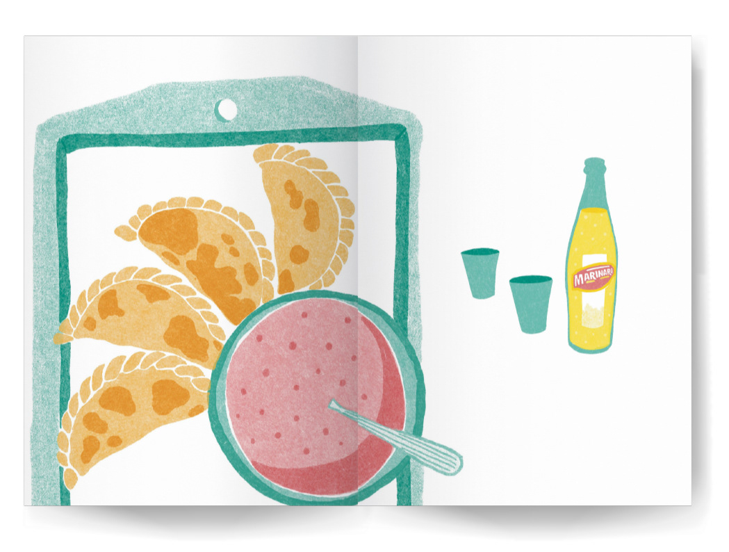
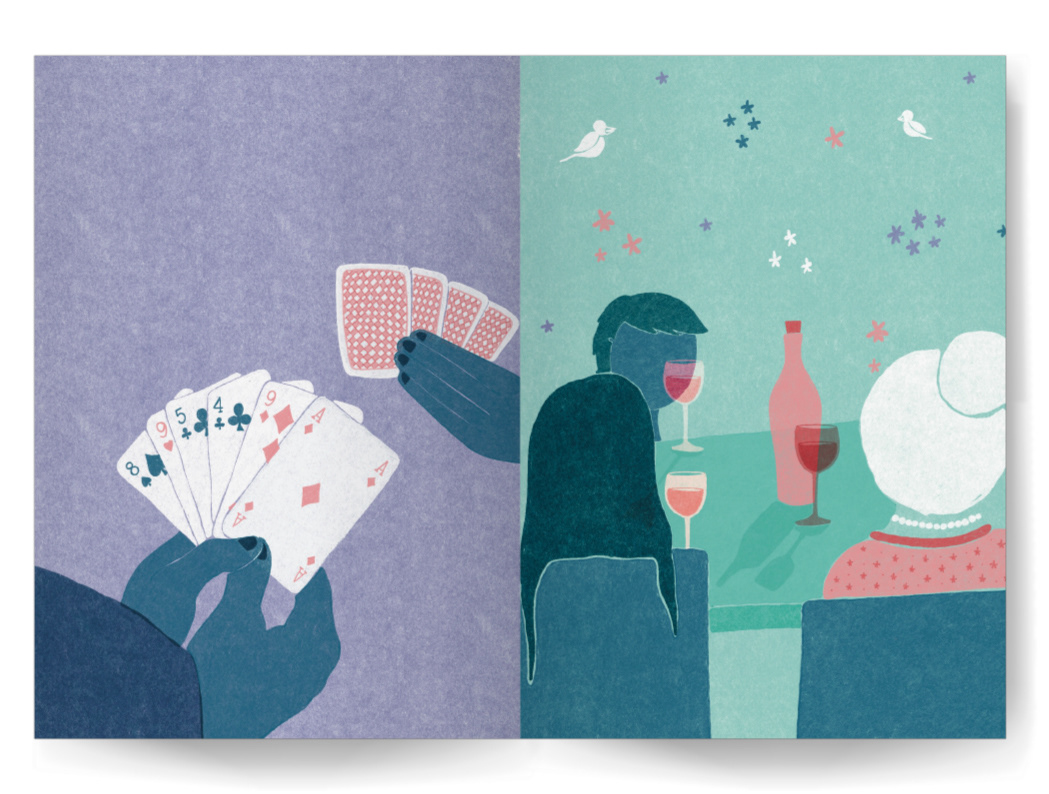
It's an illustrated book I've created, capturing special moments of my life, cherished individuals, and unforgettable places that have deeply touched my heart. May this book serve as a gentle reminder that every moment holds the potential for magic when embraced with gratitude and love.
AMITIE
I have created the following project for the brand Brulee, a fragrance and perfume brand that embodies the essence of the independent, free, and authentic woman. On this occasion, I was called upon to contribute to the Friends Day campaign, and my proposal was to create cards representing the friendship between women in their various daily activities, depicted through illustrations.
MAS AFRICA
This project was carried out for the Chilean NGO Mas Africa. Its aim was to represent the NGO's work both in communities across Africa and in vulnerable sectors of Chile. The main requirement was to depict the unity and equality between countries and to contribute to spreading awareness of their main cause and work.
ARIGATO SUSHI CLUB
For this project I worked in the Art Direction, the Graphic Design and the Illustrations for Arigato Sushi Club. It was an integrated work in which my goal was to create a sophisticated and relaxed brand image, using traditional Japanese elements and soft, subtle colors.
The result was a brand that elegantly and modernly reflects the essence of Japanese cuisine and the ambience of the restaurante.
The result was a brand that elegantly and modernly reflects the essence of Japanese cuisine and the ambience of the restaurante.
THE ARGENTINIAN NORTHWEST - A 'MAPOTECA' PROJECT.
Mapoteca is a company that collaborates with different artists and illustrators to create informative and illustrated maps about various concepts.
In this case I was invited to illustrate a map highlighting the traditional cultures, the flora and fauna of each region of the Northwestern Argentina.
In this case I was invited to illustrate a map highlighting the traditional cultures, the flora and fauna of each region of the Northwestern Argentina.
A UNITED WORLD - A 'TASTIL VIAJES' PROJECT.
'Tastil Viajes' is a travel company that offers both domestic trips around Argentina and international journeys
around the world.
My challenge was to create illustrations that, with just a glance transport viewers to different parts of the world, ensuring that each of these places harmonized with one another.
The illustration was used for the company's storefront at a prominent city location in Salta, Argentina. And was also used for brochures, prints, and merchandising.
\\
WOMEN OF THE WORLD
This project revolves around the power of women and how often their voices serve as the backbone in many instances of inequality worldwide. It encompasses illustrations of women from various corners of the globe, spanning different ages, cultures, religions, and beliefs. It's a tribute to all women, grounded in our inherent power, championing equality, and embracing all our differences.
'A MAN SCAPING FROM THE WORLD'.
This illustration was created for a project displayed in various museums and cultural centers like the Centro Cultural Kirchner in Buenos Aires and the Casa de la Cultura in Salta. The project, featured in a book with renowned illustrators from Argentina and worldwide, commemorates the 30th anniversary of Argentina's 'Taller Azul' (Blue Workshop), an art academy for children. The project aimed to have established illustrators collaborate with student children to illustrate stories. In this case, the illustrator continued the concept initiated by a 5-year-old child, Bautista, depicting a man fleeing from the stars.
'HANDS OF FLAMINGO'.
The massage and wellness center, Hands of Flamingo, reached out to me to create their brand identity. The brand was meant to embody calmness, wellness, and a connection with nature. The following illustration was used for the creation of flyers, business cards, and brand merchandise.
'LOVE IN TIMES OF PANDEMIC' - DOT PARKER MAGAZINE.
For this project, I was commissioned by Dot Parker magazine to illustrate the cover of that edition. It was during the height of the Covid pandemic, and I decided to contemplate love during those challenging times. I thought about the love of an older couple: the nostalgia it evokes, all the moments they would have shared together, and yet still finding joy in an evening, sharing a glass of wine on the balcony of some remote city.
'MARADONA' - DOT PARKER MAGAZINE.
Once again, I was summoned by Dot Parker magazine for a project. Though the original concept was entirely different, amidst our work, news of the passing of football legend Diego Maradona emerged. While for many around the world it might have been just another day, for Argentina and Naples, it meant the loss of a beloved icon—almost a deity—whose departure deeply resonated with citizens.
It became imperative to center the cover edition of the magazine around him during that time. I envisioned a city, Naples in Italy, completely shaken by the news. I thought of its altars, its tributes, in every nook and cranny, and in the subtle details that evoke the presence of this popular idol.
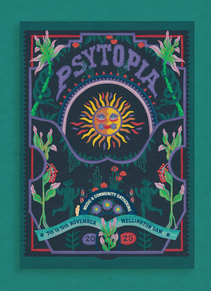
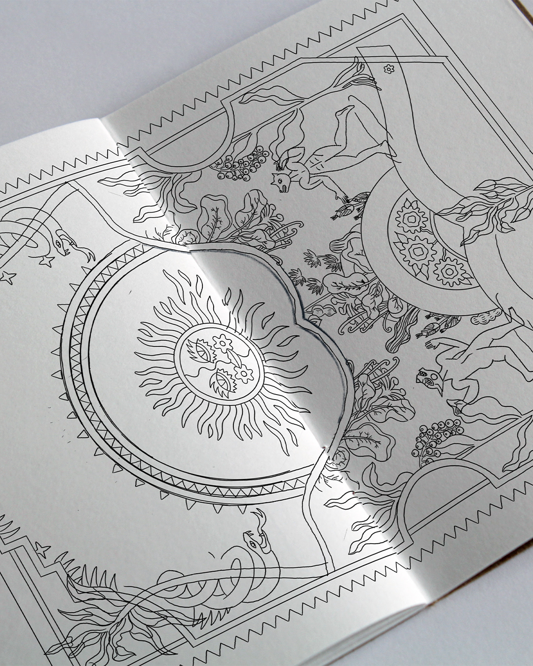
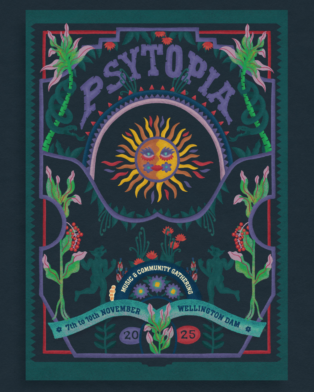
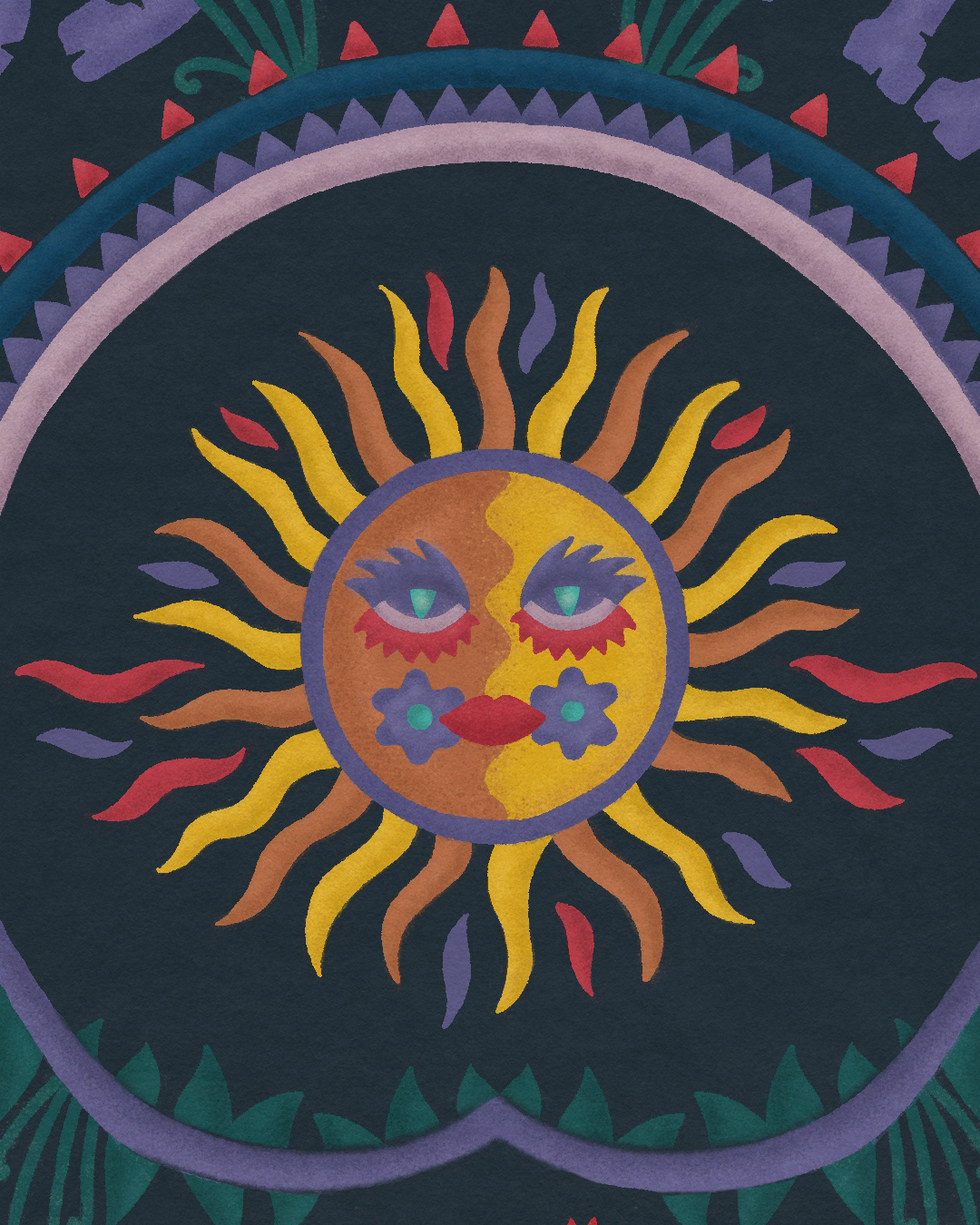
'PSYTOPIA'
llustration, Graphic Design & Art Direction
for 'Psytopia' Music Festival in the magical Margaret River, Western Australia .
Inspired by nature, dance and the vibrant local spirit, this project brings together creativity and storytelling to celebrate one of the most unique festivals in the region.
Proud to have contributed with visuals that connect music, movement and environment into an immersive experience.
'HAPPY DOOOOF DAY'
I was contacted by a festival production company based in Western Australia to promote a new event that would take place amidst nature. I drew inspiration from the symbiosis between humans and nature, as well as the constant flow of movement that connects them. The illustration was used for creating flyers, the website design, and event merchandise.
'THE END OF BRAEVERSE'
Once again, I was called upon by the festival production company in Western Australia to promote a new festival. For this event, I drew inspiration from a small house on the grounds, surrounded by characteristic trees, birds, and snakes. The ongoing symbiosis between humans and nature, creating a very special connection, was the central focus of my creation.